Understanding Digital Currency Graphs: A Beginner's Guide

How to Read Crypto Charts
Cryptocurrency trading has become increasingly popular, with digital assets experiencing significant price fluctuations. Understanding what is crypto charts and how to interpret them is essential for traders who want to make informed decisions in this volatile market. This guide provides comprehensive information on the fundamental concepts and tools needed to analyze cryptocurrency price charts effectively.
What Is a Crypto Price Chart?
A crypto price chart is a graphical representation that displays detailed information about a cryptocurrency's historical and current trading activity. Understanding what is crypto charts begins with recognizing that these charts typically feature time frames (such as hours, days, or weeks) on the horizontal axis and prices (usually quoted in U.S. dollars) on the vertical axis.
There are two primary types of crypto price charts:
Line charts use a continuous solid line to illustrate the median closing price of a cryptocurrency over time. The closing price represents the final trading cost of a crypto asset within a predetermined period. These charts are straightforward and easy to understand, making them ideal for beginners who want a quick overview of price trends.
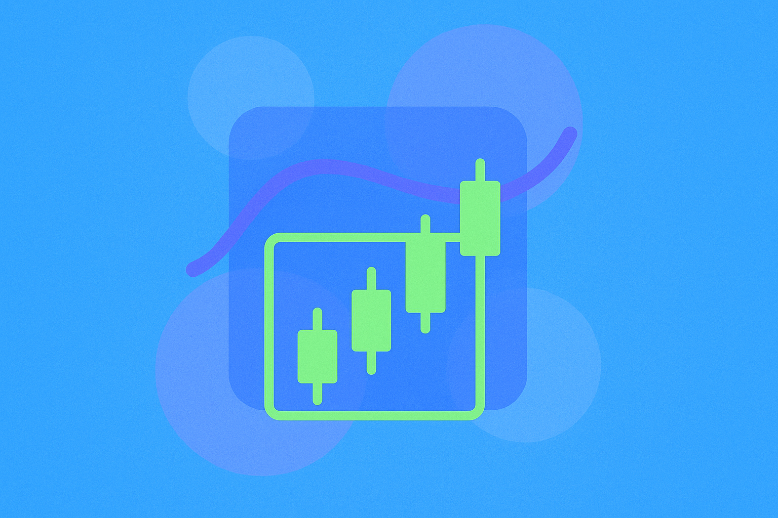
Candlestick charts utilize rectangular shapes called candlesticks to represent trading activity within specific time frames. For example, on a daily Bitcoin candlestick chart, each candlestick represents 24 hours of BTC price movements. Candlestick charts provide more detailed information compared to line charts, including opening prices, closing prices, and trading ranges.
While line graphs offer simplicity and intuitive readability, candlestick charts are preferred by most crypto traders because they provide access to more comprehensive data points. By adjusting the time frames on candlestick charts, traders can analyze multiple periods of trading history simultaneously, gaining deeper insights into market behavior and price patterns.
Why Do Traders Use Price Charts?
Price charts serve as essential tools that help traders visualize both historical and current price activity of assets, particularly cryptocurrencies. When learning what is crypto charts, it's important to understand that although analyzing past trading data cannot guarantee future price performance, these charts play a crucial role in helping short-term traders develop trading strategies, set indicators, and make decisions about opening or closing positions.
Technical analysis is an entire field of market research dedicated to studying chart data and patterns. Unlike fundamental analysis, which examines factors such as a cryptocurrency's history, network activity, and circulating supply, technical analysis focuses on using chart patterns, statistical data, and trendlines to predict future prices and establish trading positions.
Traders who employ technical analysis rely heavily on charting tools to identify optimal entry and exit points for their trades. By examining historical price patterns, support and resistance levels, and various technical indicators, they can develop informed trading theses and select price points that align with their risk tolerance and trading objectives. This systematic approach to analyzing market data helps traders make more rational decisions in the often chaotic cryptocurrency market.
Essential Features of A Crypto Chart
When first encountering a candlestick crypto chart, the amount of information displayed can seem overwhelming. However, to fully grasp what is crypto charts, understanding several key features is essential for interpreting chart data correctly:
Trading pair refers to the combination of two assets being compared on a chart. Most commonly, crypto price charts pair a cryptocurrency with a fiat currency, such as the U.S. dollar, to provide transparent price comparisons. For example, a "BTC/USD" pair displays Bitcoin's price in terms of U.S. dollars. However, traders can also compare cryptocurrencies against other digital assets available on their trading platform. A "Bitcoin/Ethereum" trading pair, for instance, would show Ethereum's relative value compared to Bitcoin.
Unit of time represents the duration each data point covers on the horizontal axis. Price charts can track crypto prices using different time intervals, such as minutes, hours, days, or weeks. If a chart is set to an "hourly" time frame, each candlestick represents one hour of trading data. Most crypto trading platforms allow traders to adjust these time frames according to their specific analytical needs and trading strategies.
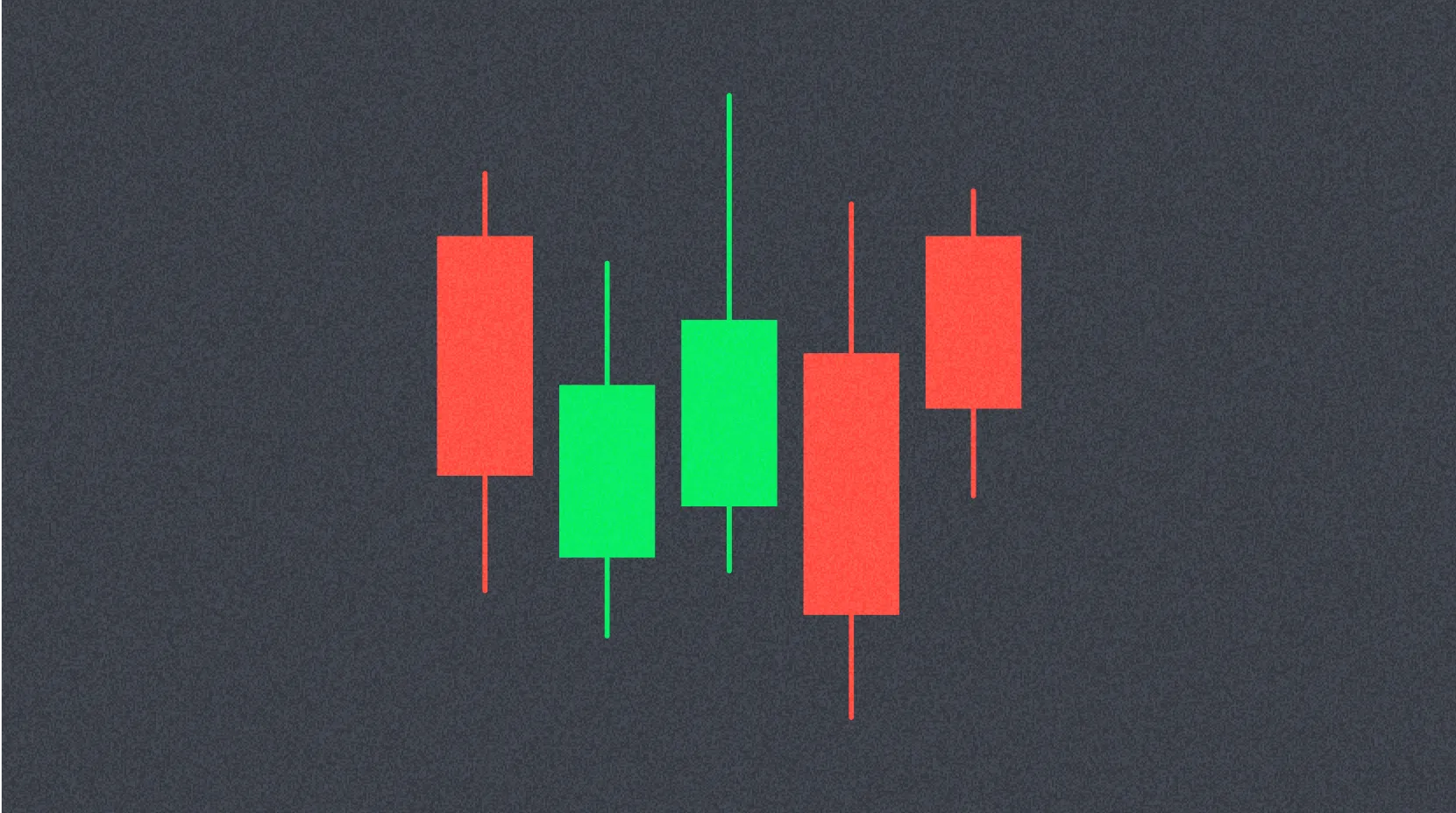
Candlesticks are the thin rectangular shapes that display price activity for a crypto asset within the selected time frame. Green candlesticks indicate that the asset's price closed higher than it opened, with the closing price at the top of the rectangle. Red candlesticks show that the price closed lower than it opened, with the closing price at the bottom. Candlesticks may also feature thin lines called "wicks" extending from the top and bottom of the main body. These wicks indicate the highest and lowest prices reached during the trading session, though they don't represent opening or closing prices.
Trading volume measures the total quantity of a cryptocurrency traded during the chart's selected time frame. This information appears in a bar graph below the main price chart. Green bars indicate that there are more buyers than sellers for the cryptocurrency during that period, while red bars signify that more traders are selling than buying. The height of each bar correlates with the level of trading activity––taller bars indicate higher trading volume and more active market participation.
How to Read Candlestick Charts in Crypto
Understanding how to interpret individual candlesticks is fundamental to reading crypto charts effectively and comprehending what is crypto charts in practice. Let's examine a practical example to illustrate this concept.
Consider a scenario where a trader examines a single candlestick on a daily Bitcoin chart with the following characteristics:
- Green color
- A top wick extending from $95,000 to $96,000
- A solid rectangular body extending from $93,500 to $95,000
- A bottom wick extending from $93,500 to $92,800
In this example, Bitcoin opened at $93,500 at the beginning of the 24-hour period and closed at $95,000 by the end of the session. During this time frame, BTC's price traded as low as $92,800 (shown by the bottom wick) and as high as $96,000 (indicated by the top wick). However, the bulk of the trading activity occurred between $93,500 and $95,000, represented by the solid body of the candlestick.
Now, if the same candlestick were red instead of green, the interpretation would change significantly. In this alternative scenario, $95,000 would represent the opening price, and $93,500 would be the closing price. This means Bitcoin decreased in value by $1,500 over the 24-hour period. The wicks would still indicate BTC's full trading range during the session, showing that the price touched $96,000 at its highest point and $92,800 at its lowest point, but these extremes don't represent the opening or closing prices.
This fundamental understanding of candlestick construction enables traders to quickly assess whether an asset gained or lost value during a given period and understand the range of price movement that occurred.
Where Can I See Crypto Charts?
Crypto traders have numerous options for accessing real-time price charts and historical data. Both centralized trading platforms and decentralized trading platforms provide comprehensive price charts for all cryptocurrencies listed on their platforms. Traders with accounts on these platforms can easily access charting tools and view past and present price patterns for any available crypto asset.
Beyond cryptocurrency trading platforms, a wide variety of third-party websites offer live cryptocurrency charts and analytical tools. Crypto price aggregators, for example, compile data from multiple sources to provide comprehensive price charts for numerous crypto assets. These platforms are particularly useful for individuals who don't have accounts on crypto trading platforms but still want to perform preliminary technical analysis or research cryptocurrency prices.
Many of these third-party charting platforms offer additional features such as customizable indicators, drawing tools, and the ability to compare multiple cryptocurrencies simultaneously. Some popular options include dedicated charting websites that specialize in providing advanced technical analysis tools for traders of all experience levels.
How to Try to Predict Prices with Crypto Charts
Technical analysis encompasses a vast array of tools and strategies, with each trader developing their own preferred approach to analyzing price data. To fully understand what is crypto charts and their practical applications, several standard techniques can help new traders begin their journey into chart analysis:
Trendlines are horizontal lines that traders draw across the tops and bottoms of candlesticks to identify the general direction of a cryptocurrency's price movement. When candlestick patterns tilt upward, the market exhibits a bullish pattern, indicating more buyers than sellers. Conversely, downward-sloping trendlines suggest a bearish pattern, where sellers outnumber buyers. Trendlines also help identify critical price levels where cryptocurrencies tend to bounce. These include support levels (the bottom of a price range where buying pressure prevents further declines) and resistance levels (the top of a price range where selling pressure prevents further increases). By drawing trendlines, traders can recognize market sentiment and identify strategic prices for entering or exiting trades.
Moving averages (MAs) are similar to trendlines but represent an asset's average closing price over a specified period. For instance, a 50-day moving average for Bitcoin calculates the mean price of BTC over the past 50 days. Moving averages help smooth out price fluctuations and reveal underlying trends. Generally, when a crypto asset trades below most of its moving averages, it's considered to be in a bear market. Conversely, when cryptocurrencies break above their moving averages, it often signals bullish sentiment and potential upward momentum.
Relative Strength Index (RSI) is a momentum oscillator displayed as a line graph below the main price chart. It measures the speed and magnitude of price changes within a set time frame, typically 14 periods. RSI values range from 0 to 100. When the RSI approaches 100, it suggests that traders may have overbought the cryptocurrency, potentially indicating an upcoming price correction as traders take profits. Conversely, RSI scores near 0 indicate that the cryptocurrency may be oversold, suggesting it could represent good value and might be due for a price increase.
Fibonacci ratios are based on the mathematical sequences discovered by Italian mathematician Leonardo Fibonacci. These ratios (23.6%, 38.2%, 50%, 61.8%, and 100%) appear throughout nature in various forms, including hurricane formations, sunflower seed patterns, and Nautilus seashell spirals. In trading, these ratios are used to predict potential support and resistance levels where a cryptocurrency's price is likely to pause, reverse, or continue its trend. Traders apply Fibonacci retracement and extension tools to identify these key price levels and make more informed decisions about entry and exit points.
Conclusion
Mastering the art of reading crypto charts is an essential skill for anyone interested in cryptocurrency trading. Understanding what is crypto charts and their various components provides the foundation for successful trading analysis. By understanding the fundamental components of price charts, including candlesticks, trading volumes, and various time frames, traders can gain valuable insights into market behavior and price trends. While technical analysis tools such as trendlines, moving averages, RSI, and Fibonacci ratios cannot guarantee future price movements, they provide a systematic framework for analyzing market data and making informed trading decisions.
Decentralized trading platforms offer traders access to hundreds of technical indicators and candlestick chart patterns, enabling comprehensive analysis of cryptocurrency price performance. From moving averages and Bollinger bands to RSI and the Ichimoku cloud, modern trading platforms provide countless technical tools to support traders in their analysis. However, traders should remember that multiple approaches to chart analysis exist, and developing a personalized strategy that aligns with individual risk tolerance and trading goals is crucial for long-term success in the cryptocurrency market. By mastering what is crypto charts and applying these analytical tools consistently, traders can enhance their ability to navigate the dynamic cryptocurrency markets effectively.
FAQ
How do crypto charts work?
Crypto charts visualize price movements using candlesticks or bars, displaying open, high, low, and close prices. They help traders identify trends and trading opportunities through visual representation of price history and trading volume data.
How to analyze crypto charts for beginners?
Focus on candlesticks: green indicates price increases, red shows decreases. Monitor trading volume below the chart. Learn patterns like bullish head and shoulders to predict upswings. These fundamentals help identify potential price movements.

Decoding the KDJ Indicator: A Comprehensive Guide
Understanding Bullish Candlestick Patterns for Effective Trading Strategies

How to Interpret MACD and RSI Signals for Cryptocurrency Trading?
How to Interpret MACD, RSI, and Volume Signals for Crypto Trading?
Mastering the Triple Top Pattern for Profitable Trading Strategies
Discover the Dynamics of the Rising Wedge Pattern in Trading
What is cryptocurrency compliance and regulatory risk in 2026
What is the current crypto market cap ranking and 24h trading volume in 2026
What is the fundamentals analysis of a cryptocurrency project: whitepaper logic, use cases, technology innovation, roadmap progress, and team background explained
How to Use MACD, RSI, and KDJ Technical Indicators for Crypto Trading Signals

What is the current crypto market cap ranking and trading volume overview in 2026?